

Most Shopify homepages are built around what the merchant wants to show. The ones that convert are built around what the shopper needs to decide. Those are two very different briefs, and the gap between them is where the majority of homepage bounce rates live.
A well-structured Shopify homepage doesn't need to be beautiful or complex. It needs to answer three questions in roughly three seconds: what does this store sell, why should I trust it, and where do I go next? Every design decision should serve those three answers. The stores that do this well shorten the path from first visit to purchase — not by being more persuasive, but by removing the friction that makes decision-making slow.

The Homepage's Actual Job
It helps to be clear about what a homepage is not. It's not a portfolio of everything you sell. It's not a brand lookbook. It's not a place to introduce every promotion running simultaneously. A homepage is a routing tool — its job is to get the right visitor to the right product page as quickly as possible, while establishing enough trust and context to make them want to stay.
According to Praella's analysis of Shopify homepage design data, 50–80% of visitors decide whether to stay or leave within the first three seconds. That window is set before they've scrolled, before they've read your copy, and before they've evaluated your products. What they're assessing in those three seconds is whether the page feels relevant to what they came for and whether it looks like a legitimate place to buy.
Three signals determine that first impression: visual clarity (does this look like a real store?), message match (does this sell what I was looking for?), and navigation legibility (can I find where to go?). Every section of the homepage either strengthens or undermines those three signals.
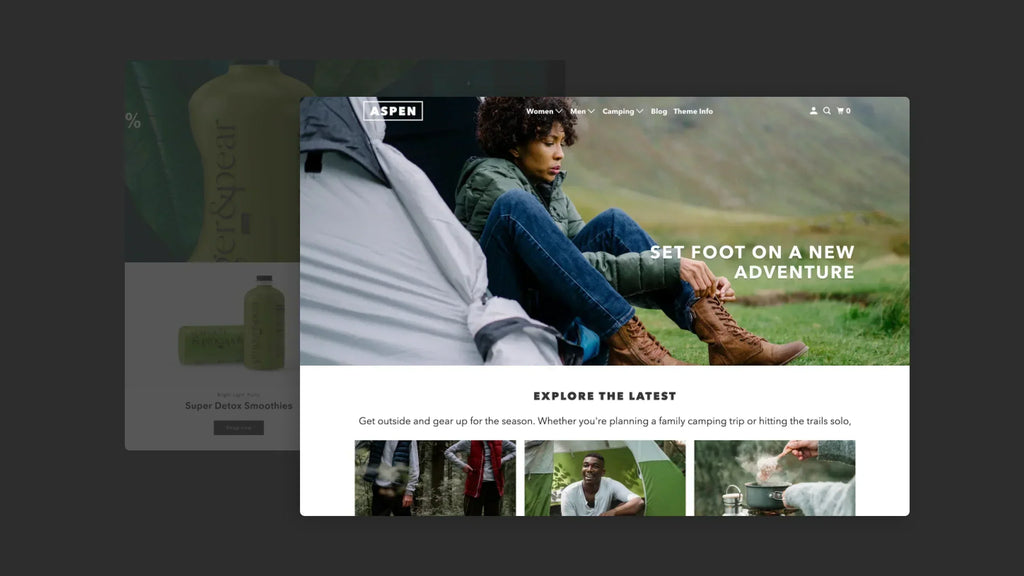
The Hero Section: One Message, One Action
The hero — the first section visible above the fold — is the single highest-leverage piece of real estate on your homepage. It's where first impressions form and where the routing decision begins. Most stores underuse it by treating it as a design space rather than a conversion tool.
An effective hero section has four elements, each doing a specific job:
- A headline that names what you sell or who you sell it to. Not a tagline, not a brand statement — a clear declaration. "Running gear for trail athletes" does more conversion work than "Move differently." The shopper who landed looking for running gear is immediately confirmed; the one who didn't self-selects out, which is equally valuable.
- A sub-headline that names one specific benefit or differentiator. What makes this store worth buying from versus searching elsewhere? Free shipping above a threshold, a specific brand promise, or a product attribute that isn't obvious from the product category alone.
- A single primary CTA. According to FoxEcom's analysis of high-converting Shopify homepage examples, clear CTAs that align directly with customer intent can increase conversion rates by up to 161%. The CTA should route the visitor to their most likely destination — a bestselling collection, a product finder, or a specific campaign — not to the homepage itself.
- An image that shows the product in use, not just displayed. Lifestyle photography that puts the product in a recognisable context tells the shopper what owning it looks like. Studio photography tells them what it looks like on a white background. For most categories, context converts better than clarity.
What to avoid in the hero: image carousels. According to ConvertCart's Shopify homepage CRO analysis, eCommerce image carousels are too fast, too difficult for customers to control, and too confusing to navigate — particularly on mobile. A single static hero with one strong message outperforms a rotating carousel in almost every documented A/B test.

Navigation: Fewer Options, Faster Decisions
Navigation isn't a design feature — it's a conversion mechanism. Every item in the top navigation is a decision point, and every unnecessary decision point adds cognitive friction that slows down the path to purchase.
According to Shopify's own homepage design guide, the goal is to get visitors to their destination in as few clicks as possible. The practical implementation: limit top-level navigation to four to six items maximum, use the footer for secondary pages (FAQ, Contact, About), and name collections based on buyer intent rather than internal product taxonomy.
The distinction between buyer-intent and taxonomy naming matters in practice:
| Taxonomy naming (weak) | Intent naming (stronger) | Why it converts better |
|---|---|---|
| Denim | Everyday Denim | Names the use case, not just the material |
| Supplements | Recovery & Sleep | Speaks to outcome, not category |
| Accessories | Complete the Look | Frames the decision in terms of what the shopper already has |
| New Arrivals | Just Landed | Minor — but conveys recency with less corporate language |
| Source: Craftberry CRO analysis 2026; Shopify homepage design guide; Kiwi Sizing best practices | ||
A site search bar belongs in the header for any store with more than 30 SKUs. Shoppers who use site search convert at 3–5x the rate of those who browse (AddSearch eCommerce research) — and the search bar is most visible, and most used, from the homepage.
Featured Collections: Guide the Browse, Don't Dump the Catalog
Below the hero, the most conversion-effective section is a curated set of featured collections — not a product grid, not a promotional banner stack, but a clear visual guide to the main buying paths available in the store.

According to Kiwi Sizing's analysis of Shopify homepage best practices, many stores give too much space to random promotions and too little space to helping people browse the catalog. Collections do the browsing job better because they let visitors shop by type, use case, audience, or season — giving the homepage a logical structure that makes it feel organised rather than overwhelming.
The effective featured collections section has three to six collection tiles, each with:
- A clear collection name (intent-based, not taxonomy-based)
- A single strong image that represents what's in the collection
- A direct link to the collection page — not a modal, not a product popup
What to avoid: featuring collections that have too few products to warrant their own page (fewer than five), featuring every collection in the store simultaneously, and using low-quality or inconsistently styled imagery across collection tiles. Visual inconsistency in this section signals a store that hasn't been curated, which undermines the trust that the hero section was building.
Trust Signals: Place Them Before Shoppers Start Doubting
According to IT Geeks' analysis of Shopify homepage conversion factors, 95% of shoppers read online reviews before making a purchase, and 72% say positive reviews build trust in a business (Oberlo, 2024). But reviews aren't the only trust signal a homepage needs — and they're not always the right one to lead with.
Trust signals work at different stages of the homepage scroll. Each needs to appear before the doubt it's addressing becomes a reason to leave:
- Above or within the hero: return policy indicator, shipping threshold, or trust badge. Addresses the "is it safe to buy here" question before it's fully formed.
- Below the featured collections: press logos, review aggregate (star rating + total count), or customer count. Addresses "have other people bought from this store?" before the shopper decides whether to explore product pages.
- Mid-page: individual customer reviews or UGC photos. Addresses "what do real buyers think of the products?" — the question that arises once the shopper has decided the store seems legitimate and is now evaluating the products.
- Near the footer: certifications, payment security logos, and contact information. Addresses residual "is this store legitimate?" doubt for the minority of shoppers who reach this far without committing.
A McKinsey study cited in Shopify's homepage design analysis found that personalisation can produce a 10–15% increase in sales conversion rates. For stores with returning visitor data, showing personalised product recommendations or collection suggestions on the homepage captures this lift without any additional traffic cost.
Speed: The Foundation Everything Else Depends On
According to On Tap Group's Shopify CRO guide, a site that loads in one second converts three times better than one that takes five seconds (Potent research). For the homepage specifically, this matters more than any other page because it's the first page most new visitors experience — and a slow homepage sets a performance expectation for the entire store before the shopper has seen a single product.
The homepage-specific speed fixes that have the largest impact without a developer:
- Compress the hero image. The hero image is almost always the Largest Contentful Paint (LCP) element — the single asset that determines how fast the homepage feels. Target under 200KB for the hero image, use WebP format, and ensure it's specified as high-priority loading in your theme settings.
- Remove autoplay video from the hero. Background videos substantially increase page weight and frequently cause layout shift as they load. A strong static image with intentional photography achieves the same visual impact at a fraction of the load cost.
- Audit homepage-loaded apps. Every app that injects JavaScript loads it on the homepage even when the app has no homepage function. According to Sunday Citizen's documented speed case study cited by On Tap Group, focused performance optimisation produced a 25% improvement in LCP and a 61% improvement in Cumulative Layout Shift — both of which directly affect bounce rate.

Final Thoughts
A homepage that helps people buy faster isn't a creative project — it's a structural one. The hero answers what and why. The navigation answers where. The featured collections guide the browse. The trust signals remove doubt at the moments it forms. The speed ensures none of that work is undermined by a loading spinner.
The merchants who convert homepage visitors at the highest rates aren't necessarily the ones with the best design or the most products. They're the ones who've made it easiest for an interested shopper to understand the store, trust it quickly, and find a direct path to the product they came looking for.
Building a homepage that consistently converts on Shopify comes down to treating every section as a conversion tool with a specific job — and removing every element that doesn't serve that job.
FAQ
How Many Sections Should a Shopify Homepage Have?
Enough to answer the three core questions — what you sell, why to trust you, and where to go next — without requiring excessive scrolling. For most stores, five to eight sections covers this. More sections typically add confusion rather than value.
Should I Use a Carousel or Slideshow in the Hero Section?
No. Documented A/B test data consistently shows that carousels underperform single static heroes. Shoppers don't wait for slides to rotate, and carousels create decision paralysis by presenting multiple competing messages simultaneously.
Where Should Social Proof Appear on the Homepage?
At minimum: review aggregate near the top (above or just below featured collections) and individual reviews mid-page. Trust signals should appear before the doubt they address — not after it has already caused a bounce.
Does Homepage Speed Actually Affect Conversion?
Directly. A one-second improvement in load time correlates with approximately 2% conversion lift (Blend Commerce, 2026). The hero image is almost always the primary speed bottleneck — compress it first before optimising anything else.
We only recommend tools we've tested and trust. This post may include affiliate links, meaning we may earn a commission if you choose to purchase - at no extra cost to you.


